

Data-driven working means deciding on measured facts instead of on instinct or habit. Organizations grow into it across five levels: from figures assembled by hand for every question, through one shared source with fixed definitions, to figures that genuinely change the direction of a meeting.
That definition is the easy part. Almost every board already agrees with it, and almost no organization fully lives up to it. The reports exist, the figures are usually right, and the decision in the monthly meeting still comes down to the judgement of whoever has been around longest.
That is rarely down to a shortage of data. It is down to the distance between the figure and the decision: someone has to look the number up, someone else has to believe it is correct, and by the time both are settled the meeting has moved on to the next item.
So data-driven working is not a switch you flip, it is a sequence you walk through. Below: the five levels in between, the level most organizations are better off stopping at, and the step you start with on Monday.
What data-driven working actually means
It comes down to two things at once: a decision is only made once the figure is on the table, and everyone at that table is looking at the same figure. So this is not about producing more reports, it is about arguing less over the reports you already have.
Three things have to be in place, and the order matters:
- One place the figure comes from. As long as revenue can come out of three systems, every conversation is about the source rather than the outcome. That is what a single source of truth means: one definition, one origin.
- An agreement on what the figure means. Does an order count on the day it is placed or the day it ships? Is VAT included? Without that answer, every report stays an interpretation.
- A decision attached to it. A number that obliges nobody to do anything is reporting. Only once behaviour changes because of it does it become steering information.
You will also see “data-informed” used, and there the difference is real. The figure weighs heavily, but it does not decide on its own. For most organizations that is exactly where you want to land, because market knowledge and experience are data as well, they have simply never been measured.

Why data-driven working so often stalls
Not one organization has come out of the past decade with less data than it had ten years ago. The number of decisions resting on a measured fact has barely moved in that same period. That is the heart of it: the shortage is not in the data, it is in figures everyone trusts and someone is committed to.
Eurostat shows how unevenly that is spread. In 2025, 33.02 percent of EU enterprises with ten or more employees analysed data using their own people. Among large enterprises that was 78.84 percent, among small ones 27.86 percent, and the breakdown by company size sits in the European digitalisation statistics. Almost three times as many, while both groups run comparable systems and record the same kinds of transactions. What the large enterprises have extra is not data. It is the capacity to do something with it.
In a mid-sized company it usually gets stuck on three things:
- The sources sit apart from each other. Sales in the CRM, invoices in the accounting package, hours in something else again. Every system is right about its own slice and nobody is right about the whole.
- No one owns a definition. Without an owner, the meaning of a KPI quietly shifts with whoever calculates it, and nobody notices until two reports contradict each other.
- It sits with someone who has no time for it. Data-driven working tends to land with the colleague who happens to be good with Excel, on top of their actual job. It survives exactly as long as their calendar allows.
The five levels of data maturity
Data maturity is nothing more than the answer to how far along you are. Dozens of models exist and they differ less than their names suggest. This is what the five levels look like in practice:
- Level 1, ad hoc. Every request for a figure is a small job. Someone exports, pastes and checks the sums. The answer is usually right, but it arrives two days later and nobody can reproduce it.
- Level 2, repeatable. There is a fixed monthly report. Still handwork, but the layout is settled and the months are comparable.
- Level 3, shared. The sources come together in one model, definitions are fixed and everyone looks at the same screen. This is the level at which the argument over which figure is correct stops.
- Level 4, steering. The figures sit inside the rhythm of the organization. Every KPI has an owner, a target and an agreed moment where something happens when that target is missed.
- Level 5, predictive. Models look ahead and flag a problem before it lands. That needs clean history and people who can judge whether the output makes sense.
Microsoft uses a comparable scale for Power BI and Fabric and describes what you see happening in the organization at each level. The value of a model like that is not the badge you award yourself. It is seeing which level you cannot skip.
Which level should you stop at?
This is where most programmes go wrong, and not because the ambition was too low. For an organization of fifty to two hundred people, nearly all of the gain sits between level two and level four. Going from “everyone has their own figure” to “one figure with an owner” changes how you steer. Going from four to five mostly changes your IT budget.
Level five is not a certificate every organization is supposed to earn, it is an investment that has to pay for itself on a concrete prediction: how much stock, how much scrap, how much capacity next month. If you cannot put that question in one sentence, it is not time yet.
Commission a predictive model while you are still at level one and you get exactly what you asked for: a computer that forecasts the wrong number with total confidence.

How do you start with data-driven working?
Not with a tool. Start with one decision that has to get better, and work backwards from there.
That sounds abstract until you fill it in. A finance director does not want to hear six weeks after the close that margin has slipped away, but at the moment it happens. An operations director wants to know where in the process the delay appears, not that there is a delay. A managing director wants to know, for every growing revenue stream, whether anything is left of it at the bottom of the page. Three roles, three very different first questions, and therefore three different first projects.
Once that question is sharp, the rest follows from it:
- Fix the definitions before you build anything. Write down what revenue is, what margin is and over which period you measure. This costs an afternoon and prevents most of the rework further down the line.
- Connect only the sources this decision touches. Not the entire system landscape, just the two or three sources these KPIs live in. The rest comes with the next question.
- Build the smallest version that can change the decision. One screen with the figures that matter is enough to test whether anything is actually decided differently. What such a first version looks like and what it costs is worked out in our article on getting a Power BI dashboard built.
- Put it in the rhythm. A figure that is not discussed at a fixed moment does not get discussed. On the finance side that is usually the monthly review, where a financial dashboard takes the place of the handwork.
- Give every KPI an owner. Someone with a name, not a department. That person guards the definition and explains what happens when the target is missed.
Microsoft calls that last part data culture and devotes a separate guide to it, which tells you how often it is the narrowest link. The technology is usually standing within weeks. The rhythm around it is the real work.
When you are better off not starting
There are three situations in which we advise an organization not to start on data-driven working yet:
- Nothing hangs on it. If nobody can name what will be done differently once the figure is known, you are building a report that only confirms what you already believed.
- The source records are wrong. If orders go in inconsistently or hours are barely logged, a dashboard just makes that mess visible faster. Fix the entry process first, then the reporting.
- Nobody has time for it. Without someone guarding the definitions and bringing the figures into the meeting, every delivery is the beginning of its own decay.
In all three cases the answer is not “never” but “something else first”. A supplier who steps over that and starts anyway hands you an environment you will not be using in a year and will still be paying for. That is why our approach opens with that question rather than with a demo.
What changes when it works
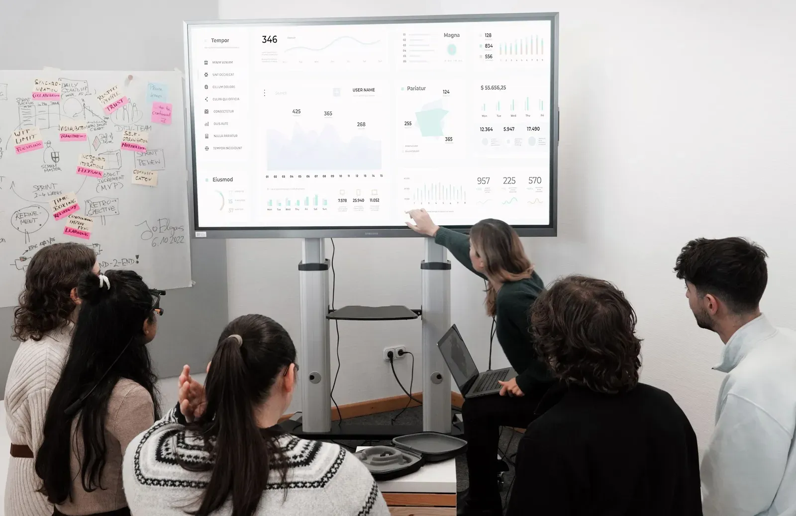
You can see the difference in a single meeting. Before, the first fifteen minutes went on whether the figure was right and the rest of the hour on explaining it. After, the figure is there, it has already been seen, and the conversation is about what you are going to do about it.
Beyond that, less changes than people expect, and that is the point. You do not meet more often, you do not report more, and there is no extra system everyone has to learn. What disappears is the preparation: the export, the manual correction, and the quarter of an hour where three people defend their own version.
What you get back is time in the place where it is worth the most, which is before the decision rather than after it. What business intelligence contributes there, and where it stops, is set out on our page about BI.
Is the decision at your organization made on the figure, or on whoever presents it most convincingly? Want to know which level you are at today and what the next step would give you? Get in touch, and we will walk through it with you.
Frequently asked questions
What is data-driven working?
Data-driven working means deciding on measured facts instead of on instinct or habit. In practice it means the figure is on the table before the decision is made, everyone is looking at the same source, and something has been agreed about what happens when that figure moves.
What is the difference between data-driven and data-informed?
With data-driven working the figure is decisive. With data-informed working it weighs heavily but sits alongside market knowledge and experience. For most organizations the second is the realistic end point, because experience in your own market is data too, it has simply never been measured.
How do you measure your organization’s data maturity?
By looking at how a figure reaches a decision, not by counting dashboards. If it is assembled by hand for every question, you are at level one. If it comes out of one shared model with fixed definitions, you are at level three. If every KPI has an owner and a target, you are at level four.
Where do you start with data-driven working?
With one decision that has to get better, sharper or faster, not with a tool. Write down which figures drive that decision, agree what they mean exactly, and connect only the sources you need for it. A first working version then takes weeks rather than months.
What are the biggest pitfalls of data-driven working?
Starting at the tool instead of the decision, collecting data that nothing is attached to, and parking it with the one colleague who happens to be good with Excel. All three produce the same result: an environment that is technically correct and that nobody opens after a few months.
Do you need a data strategy to work data-driven?
Not up front, but soon after. One concrete steering question is enough for a first project. As soon as a second and third arrive, a data strategy decides which sources, definitions and skills you need, so you are not starting from scratch with every new question.
Should data-driven working sit with IT?
IT delivers the technology, but the definitions and targets belong with the people who steer on those figures. Put ownership entirely with IT and you get reporting that is technically right and that changes no decision at all in the board meeting.
